Growing today’s brands
We’re a full service, Perth-based boutique creative studio, specialising in graphic design and brand communications for print, web and everything in-between. We are your branding partner – turning your visions and stories into awesome design and digital solutions. Through close collaboration, with extraordinary change-makers and companies of all sizes, we create real brand asset value and continually develop the brand’s ‘sweet spot’. Through graphic design, storytelling and digital experiences, we help you connect and grow your audience to ensure your brand gets the desired results. We are a team of dedicated graphic designers, strategic brand builders and intuitive web gurus, who truly know how to create, develop and maintain effective brands.
Branding
Your brand from A to Z! Branding underpins your sales and marketing funnel. And when it’s done well it will reinforce the value of your product or service in the minds of your customers – and give you an edge over competitors.
It’s been said that the best brands are built on great stories. Every element of your brand, from the colours of your logo and the design of your website, to your customer’s experience, are all part of your brand narrative. And every one of these elements should reflect your brand personality back to your customers and show them the value you can provide them.
At Design City, we help you tell your story in unique and engaging ways. So, whether you want a fully immersive website, a style guide, a compelling company profile, or a unique identity, we can help. And in doing so, help you build a successful, consistent, sustainable brand that people love.
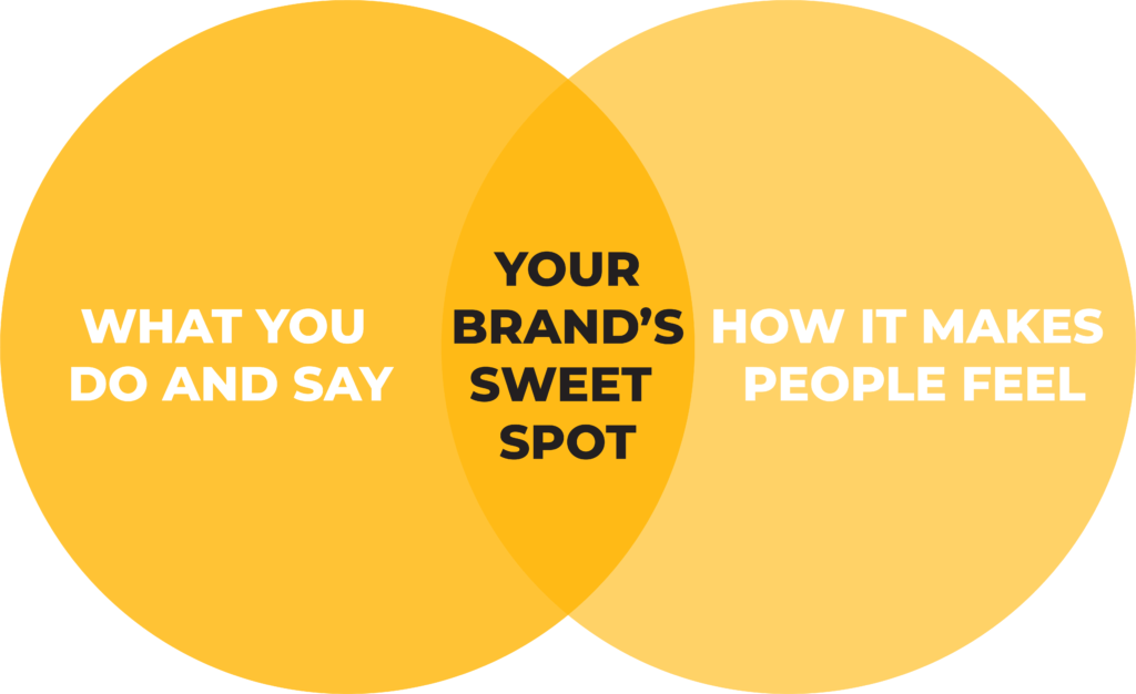
Whether you’re a start-up or established company, we understand that every business is different. We can help you create your brand ‘sweet spot’. and offer end-to-end solutions to ensure your story has valued impact wherever it’s seen and heard.

> Brand & Product Naming
When you’re a start-up, perception is everything. Which is why your brand name or product name is so important. A brand is only as effective as the strategy behind it. So we’ll start by sitting down and thinking about the big-picture. We can then define the essence of your brand, and how it connects and moves people. From here we can then build a bullet-proof strategy that defines your long-term goals, and how best to get there.
Every customer interaction builds your brand’s reputation. So when we work on your brand communications we’ll ensure you have consistency across all media channels. We’ll keep your brand message authentic, engaging and well considered.
From here we’ll work with you to create your suite of marketing collateral that aligns perfectly with your brand ethos.

> Brand Content & Focus
Effective branding requires consistent messaging—something that’s doesn’t always come naturally for organically evolved brands. We can work with you to ensure your brand strategy and messaging always hits the mark and stays relevant to your customers in a fast changing marketplace.
Every customer interaction builds your brand’s reputation. So when we work on your brand communications we’ll ensure you have consistency across all media channels. We’ll keep your brand message authentic, engaging and customer-focused.
Brand evolution is a smart decision when you’ve grown beyond your current identity in a competitive market environment. We can work with you to evolve and grow your brand and reposition it in the industry.

> Brand Development & Management
Brand evolution is a smart decision when you’ve grown beyond your current identity in a competitive market environment. We work with you to evolve and grow your brand and reposition it in the industry. And that doesn’t mean changing everything—in fact, if something is working well then, we’ll leave it. Of course, if there’s something that needs a tweak, we’ll be sure to find the ‘sweet spot’!
At Design City we help you develop a brand that inspires, influences and makes a memorable impact whenever your customers engage with it. We’ll bring your story to life through new marketing materials from internal templates and employee communications, right through to customer-facing signage, marketing materials and your website.
Think of us as your in-house branding department. As your brand guardian we’ll oversee and manage every facet of your brand collateral, ensuring consistency and tone of voice across all marketing materials, tenders, social media, and media releases.
> Brand Identities
Whether you’re looking for a new brand identity, a complete rebrand, or simply looking to breathe new life into your existing one, we work with you develop a strong and memorable brand that truly sets you apart in the industry.
We’ll start by looking at every aspect of your organisation, discovering what makes your business tick, and finding out where your business is heading in the future.
Finally, by pairing this knowledge with our craft, we’ll create a unique and memorable identity with the flexibility to evolve as your business changes.
> Brand Style Guidelines
From simple rules on logo usage, do’s and dont’s, colour palettes and photography styles, through to recommendations on tone of voice and copy, we can create style guidelines that are easy are to follow and ensure the same high quality standards are applied to your brand wherever it’s seen.
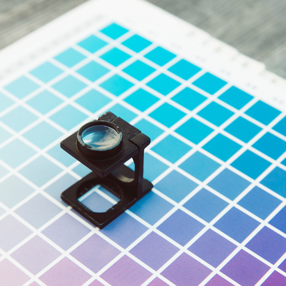
Design
First impressions count, so when a brand looks right, and feels right, it connects with the audience in a way nothing else can.
As a full service agency, we have the skills and experience required to manage all brand, creative, website and marketing projects. By working alongside you to develop a deep understanding of your business, we find your brand ‘sweet spot’ and ensure your brand is delivering a memorable and lasting experience for your clients and customers.
Our graphic design team is as eclectic as our portfolio, with experience in everything from packaging and product design, through to creative concepts, corporate identity, website design, advertising and annual reports.
By taking a holistic look at your business, we’re able to add real value through considered and strategic brand design. This is the wow factor that isn’t just skin deep, it’s ingrained in your business.
> Annual Report Design
Build your brand equity and keep your customers informed with innovative reports that deliver key information to the people that matter most.
We make the reporting process as streamlined and hassle-free as possible for you, by providing you with an end-to-end solution. From design, project management, and content management, through to editing, photography, print and online production.
Let us streamline your reporting process. We cover annual reports, quarterly reports, tender documents, information memorandums, IPO’s, prospectuses, EOI’s through to interactive microsites, interactive PDFs and stunning flip books that connect with your audience. When we design reports for you, we’ll ensure they’re always informative, innovative and on brand.
Over the years we’ve got a proven track record of creating dynamic, informative reports for a range of ASX-listed companies, local government and non-for-profit organisations.
> Logo Design
Whether you’re looking for a complete rebrand, or simply looking to breathe new life into your existing one, we’ll work with you develop a strong and memorable brand that truly sets you apart in the industry.
Startups – A strong business needs a strong foundation. As a new business starting out, you need a professional identity from which to grow. Just because you’re a new business, doesn’t mean your identity should be restricted by your budget. At Design City, we have a strong focus on value with everything we do.
Brand Refresh – Want to breathe new life into your brand? If you want to protect and strengthen an already established brand, we can rework your existing identity to bring it more in line with how your company wants to be perceived.
Brand Expansion – If you’ve recently merged or acquired a new business, a more strategic approach is required when it comes to rebranding or extending a current brand. We’re also well positioned to help you create divisions or develop umbrella brands, endorsed brands and house of brands.
> Marketing
ATTENTION – that’s what you’re fighting for! If securing a prime piece of real estate inside your target market’s mind is what you want, strategic marketing creative is how you do it.
Get your brand in front of the right eyes & ears! B2B or B2C, we’ll create insight driven marketing creative that connects with your audience and delivers your brand’s story loud & clear.
To give your business an edge over the competition, we dig deep into the psyche of your potential customers. By using targeted profiles of your audience and their behaviour, we’re able to craft strategic marketing creative that ensures your brand not only resonates with your desired market, but plants the seed for a relationship to bloom.
Already have a strong marketing strategy, but want to expand your outbound efforts? At Design City, we’ll deliver a whole suite of custom designed marketing solutions for you – from brochures & flyers, and company profiles, e-marketing and more. Whether you run a growing or established business, our marketing experience will ensure you leave a lasting impact on your target market.

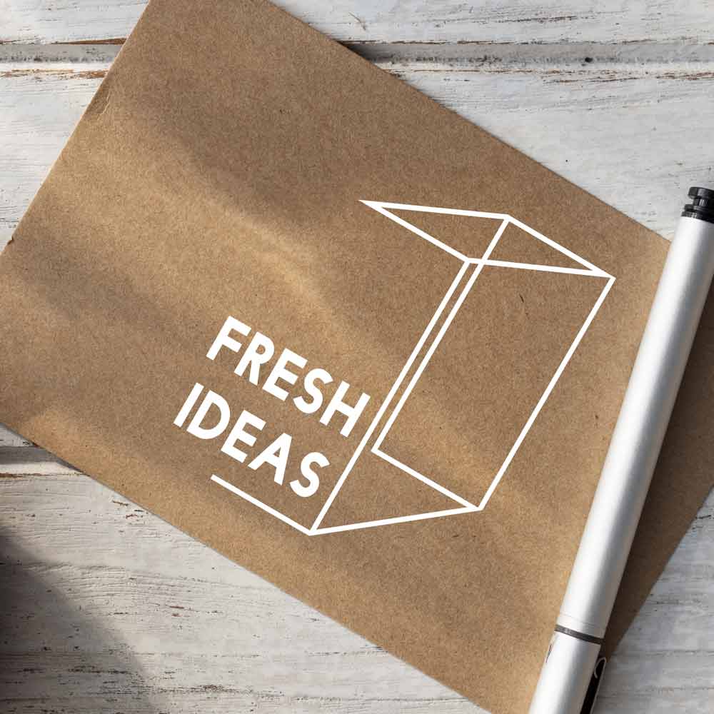
> Package Design & Production
For powerful packaging solutions, first impressions are everything. Well-designed packaging can mean the difference between a customer purchasing your product or reaching for a competitor’s.
Great branding is about the whole story – inside and out. Our goal as graphic designers is to help you cut through the noise and communicate the USP of your product in a way that makes your customers desire what’s inside.
Equally as important as standing out on the shelf, good packaging should also reinforce your brand and reflect the values that your business stands for. At Design City we understand that your brand at point of sale is crucial to the decision-making process that’s why our packaging designs connect with your customers emotionally, leaving a lasting impression and most importantly keeping you well and truly front of mind.
The marketplace is crowded, and now more than ever, you have to think outside the box – pardon the pun – in order to stand out! We can cover all shapes, sizes and styles of product packaging – including, but not limited to: boxes, labels, prototypes to food safe packaging.
> Photography & Videos
Imagery, whether static or cinematic, creates a powerful story for your brand. What’s yours? Images are everywhere, from billboards to magazines, websites to flyers. Video creates an emotional reaction from the viewer. No matter how eye-catching the headline, or provocative the copy, the image is the first thing that attracts the attention of the viewer and creates an emotional connection.
At Design City, we focus on creating imagery and video that connects, tells a story and enhances your brand. From strategic product and service photography and video, right through to story-boarding, image manipulation and art direction, let us help create an emotional connection with your audience.
Commercial photography – We understand how important it is for your business to not just connect, but make a lasting impression on your customers. The best way to achieve this is through professional, sharp and well executed photography – covering onsite-photography, corporate profiles to service showcase.
Brand photography – We dig down to find the heart and soul of your business and capture it in powerful, well crafted, branded images for marketing and advertising purposes.
Video production – incorporating story boarding, video content creation to corporate video production with a focus on brand value development.

> Presentations
Take your presentation game to the next level with branded PowerPoint templates that includes a custom inner text slide, inner image slide and title slide. We can even update existing presentations to make them pop!

> Print Management
Print is still a powerful tool to have in your marketing arsenal. Our team will help you leverage this medium by managing print broking, press checks and print house liaison. We can even secure you preferential treatment when deadlines are tight.
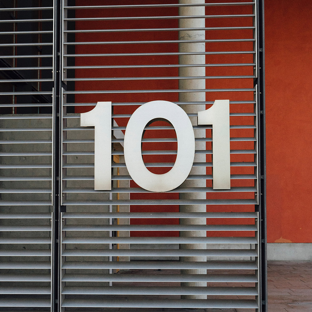
> Signage & Displays
Effective signage needs to convey a lot of information in a very short amount of time. Five seconds, to be exact.
With our years of advertising experience, we know how to reinforce brand identities, create awareness, and drive engagement through all types of signage. By understanding placement, audience and objective, we’re able to craft a design layout that makes the most of your office front, booth, or special event.
Booth design and layout – when visitors attend a tradeshow or expo, the first thing they’ll notice is the design of your booth – and this is what they’ll form their opinion on. That’s why it’s so important you showcase your brand in the best possible light. We’ve helped countless clients nail that first impression with engaging layout designs and exhibition walls, all delivered to schedule.
Banners, posters and more… if you’re not standing out, you’re blending in. Which is great if you’re playing hide & seek, but not so great when you’re at an expo, charity night or public reveal. We have the experience helping brands stand out, our team loves creating banners, posters, displays and slideshows that connect, engage and persuade your potential clients. Let us handle the entire project, from recommendations right through to print production!
> Stationery & Templates
One of the first points of contact between your business and your market, is your stationery. Needless to say, having a consistent brand across every touchpoint – both internally and externally – is imperative if you want to create a strong corporate identity.
We’ve helped countless clients take everything from their invoices, business cards, letterheads and email signatures from bland to bloody good!
Jam-packed with everything a business needs to leave a positive and lasting impression on their customers. Our experienced graphic designers will lovingly create your business cards, an word letterhead template, an HTML email footer and a PowerPoint template – all the stationery required to keep your brand consistent. Get the lot, or mix & match as required!
With no detail overlooked, professionally designed templates allow you and your team to present a compelling and consistent image, every time.
Digital
Connecting digitally with your audience is more important than ever. Yet when we look online, there’s a sea of samey-samey websites. Design City challenge this monotonous status-quo by creating custom websites and apps.
As a full service agency, we have the skills and experience required to manage all brand, creative, website and marketing projects. By working alongside you to develop a deep understanding of your business, we ensure your brand is delivering a memorable and lasting experience for your clients and customers.

> Custom Website Design & Build
The way you connect digitally with your audience is more important than ever! Yet when we look online, there’s a sea of samey-samey websites. Design City challenge this monotonous status-quo by creating custom websites and apps.
Your website is your shop window. An opportunity to showcase your brand, grab your customers’ attention and ensure they browse your store – instead of your competitors.
When we build an online presence for your business, we start by looking at what you’re trying to achieve, and create a customised solution based on your needs.
But that doesn’t mean our work is done once your site is up and running. In fact, we see ourselves as a long-term partner, not just a one-off solution. So we’ll always be there to lend our advice and support whenever you need it.
Over the years, we’ve built intuitive websites for small, medium and large organisations. All of them distinctly different, but all with one thing in common – the ability to grow their customer base with branding that works.

> Social Media Content & Management
For Facebook, Instagram, and Linkedin Marketing, expert social media consultation and influencer marketing campaigns. Grow your brand’s relevance and reach.
You can generate leads through all the major social networking sites and tell your brand’s story to engage with your prospects and advocates while you do it. Using an effective social media strategy and execution will help to attract customers and new customer segments extend on existing relationships with customers to build brand advocacy and driving loyalty which ultimately drives sales in the long term.
We support clients to utilise their online asset through social media to ensure the best use of your online investment dollar. Social platforms are a perfect opportunity to build a strong foundation to channel the brand’s voice and content on multiple networks to increase brand recognition, improve loyalty and generate reach and engagement with thousands if not millions of people.
Regardless of your company’s size, we deliver engaging content for attracting fans and followers that turn into real customers. We specialise in helping small to medium businesses evolving their online presence and maximise customer enagement through Social Media.

Branding
Your brand from A to Z! Branding underpins your sales and marketing funnel. And when it’s done well it will reinforce the value of your product or service in the minds of your customers – and give you an edge over competitors.
It’s been said that the best brands are built on great stories. Every element of your brand, from the colours of your logo and the design of your website, to your customer’s experience, are all part of your brand narrative. And every one of these elements should reflect your brand personality back to your customers and show them the value you can provide them.
At Design City, we help you tell your story in unique and engaging ways. So, whether you want a fully immersive website, a style guide, a compelling company profile, or a unique identity, we can help. And in doing so, help you build a successful, consistent, sustainable brand that people love.
Whether you’re a start-up or established company, we understand that every business is different. We can help you create your brand ‘sweet spot’. and offer end-to-end solutions to ensure your story has valued impact wherever it’s seen and heard.
> Brand & Product Naming
When you’re a start-up, perception is everything. Which is why your brand name or product name is so important. A brand is only as effective as the strategy behind it. So we’ll start by sitting down and thinking about the big-picture. We can then define the essence of your brand, and how it connects and moves people. From here we can then build a bullet-proof strategy that defines your long-term goals, and how best to get there.
Every customer interaction builds your brand’s reputation. So when we work on your brand communications we’ll ensure you have consistency across all media channels. We’ll keep your brand message authentic, engaging and well considered.
From here we’ll work with you to create your suite of marketing collateral that aligns perfectly with your brand ethos.
> Brand Content & Focus
Effective branding requires consistent messaging—something that’s doesn’t always come naturally for organically evolved brands. We can work with you to ensure your brand strategy and messaging always hits the mark and stays relevant to your customers in a fast changing marketplace.
Every customer interaction builds your brand’s reputation. So when we work on your brand communications we’ll ensure you have consistency across all media channels. We’ll keep your brand message authentic, engaging and customer-focused.
Brand evolution is a smart decision when you’ve grown beyond your current identity in a competitive market environment. We can work with you to evolve and grow your brand and reposition it in the industry.
> Brand Development & Management
Brand evolution is a smart decision when you’ve grown beyond your current identity in a competitive market environment. We work with you to evolve and grow your brand and reposition it in the industry. And that doesn’t mean changing everything—in fact, if something is working well then, we’ll leave it. Of course, if there’s something that needs a tweak, we’ll be sure to find the ‘sweet spot’!
At Design City we help you develop a brand that inspires, influences and makes a memorable impact whenever your customers engage with it. We’ll bring your story to life through new marketing materials from internal templates and employee communications, right through to customer-facing signage, marketing materials and your website.
Think of us as your in-house branding department. As your brand guardian we’ll oversee and manage every facet of your brand collateral, ensuring consistency and tone of voice across all marketing materials, tenders, social media, and media releases.
> Brand Identities
Whether you’re looking for a new brand identity, a complete rebrand, or simply looking to breathe new life into your existing one, we work with you develop a strong and memorable brand that truly sets you apart in the industry.
We’ll start by looking at every aspect of your organisation, discovering what makes your business tick, and finding out where your business is heading in the future.
Finally, by pairing this knowledge with our craft, we’ll create a unique and memorable identity with the flexibility to evolve as your business changes.
> Brand Style Guidelines
From simple rules on logo usage, do’s and dont’s, colour palettes and photography styles, through to recommendations on tone of voice and copy, we can create style guidelines that are easy are to follow and ensure the same high quality standards are applied to your brand wherever it’s seen.
Design
First impressions count, so when a brand looks right, and feels right, it connects with the audience in a way nothing else can.
As a full service agency, we have the skills and experience required to manage all brand, creative, website and marketing projects. By working alongside you to develop a deep understanding of your business, we find your brand ‘sweet spot’ and ensure your brand is delivering a memorable and lasting experience for your clients and customers.
Our graphic design team is as eclectic as our portfolio, with experience in everything from packaging and product design, through to creative concepts, corporate identity, website design, advertising and annual reports.
By taking a holistic look at your business, we’re able to add real value through considered and strategic brand design. This is the wow factor that isn’t just skin deep, it’s ingrained in your business.
> Annual Report Design
Build your brand equity and keep your customers informed with innovative reports that deliver key information to the people that matter most.
We make the reporting process as streamlined and hassle-free as possible for you, by providing you with an end-to-end solution. From design, project management, and content management, through to editing, photography, print and online production.
Let us streamline your reporting process. We cover annual reports, quarterly reports, tender documents, information memorandums, IPO’s, prospectuses, EOI’s through to interactive microsites, interactive PDFs and stunning flip books that connect with your audience. When we design reports for you, we’ll ensure they’re always informative, innovative and on brand.
Over the years we’ve got a proven track record of creating dynamic, informative reports for a range of ASX-listed companies, local government and non-for-profit organisations.
> Logo Design
Whether you’re looking for a complete rebrand, or simply looking to breathe new life into your existing one, we’ll work with you develop a strong and memorable brand that truly sets you apart in the industry.
Startups – A strong business needs a strong foundation. As a new business starting out, you need a professional identity from which to grow. Just because you’re a new business, doesn’t mean your identity should be restricted by your budget. At Design City, we have a strong focus on value with everything we do.
Brand Refresh – Want to breathe new life into your brand? If you want to protect and strengthen an already established brand, we can rework your existing identity to bring it more in line with how your company wants to be perceived.
Brand Expansion – If you’ve recently merged or acquired a new business, a more strategic approach is required when it comes to rebranding or extending a current brand. We’re also well positioned to help you create divisions or develop umbrella brands, endorsed brands and house of brands.
> Marketing
ATTENTION – that’s what you’re fighting for! If securing a prime piece of real estate inside your target market’s mind is what you want, strategic marketing creative is how you do it.
Get your brand in front of the right eyes & ears! B2B or B2C, we’ll create insight driven marketing creative that connects with your audience and delivers your brand’s story loud & clear.
To give your business an edge over the competition, we dig deep into the psyche of your potential customers. By using targeted profiles of your audience and their behaviour, we’re able to craft strategic marketing creative that ensures your brand not only resonates with your desired market, but plants the seed for a relationship to bloom.
Already have a strong marketing strategy, but want to expand your outbound efforts? At Design City, we’ll deliver a whole suite of custom designed marketing solutions for you – from brochures & flyers, and company profiles, e-marketing and more. Whether you run a growing or established business, our marketing experience will ensure you leave a lasting impact on your target market.
> Package Design & Production
For powerful packaging solutions, first impressions are everything. Well-designed packaging can mean the difference between a customer purchasing your product or reaching for a competitor’s.
Great branding is about the whole story – inside and out. Our goal as graphic designers is to help you cut through the noise and communicate the USP of your product in a way that makes your customers desire what’s inside.
Equally as important as standing out on the shelf, good packaging should also reinforce your brand and reflect the values that your business stands for. At Design City we understand that your brand at point of sale is crucial to the decision-making process that’s why our packaging designs connect with your customers emotionally, leaving a lasting impression and most importantly keeping you well and truly front of mind.
The marketplace is crowded, and now more than ever, you have to think outside the box – pardon the pun – in order to stand out! We can cover all shapes, sizes and styles of product packaging – including, but not limited to: boxes, labels, prototypes to food safe packaging.
> Photography & Videos
Imagery, whether static or cinematic, creates a powerful story for your brand. What’s yours? Images are everywhere, from billboards to magazines, websites to flyers. Video creates an emotional reaction from the viewer. No matter how eye-catching the headline, or provocative the copy, the image is the first thing that attracts the attention of the viewer and creates an emotional connection.
At Design City, we focus on creating imagery and video that connects, tells a story and enhances your brand. From strategic product and service photography and video, right through to story-boarding, image manipulation and art direction, let us help create an emotional connection with your audience.
Commercial photography – We understand how important it is for your business to not just connect, but make a lasting impression on your customers. The best way to achieve this is through professional, sharp and well executed photography – covering onsite-photography, corporate profiles to service showcase.
Brand photography – We dig down to find the heart and soul of your business and capture it in powerful, well crafted, branded images for marketing and advertising purposes.
Video production – incorporating story boarding, video content creation to corporate video production with a focus on brand value development.
> Presentations
Take your presentation game to the next level with branded PowerPoint templates that includes a custom inner text slide, inner image slide and title slide. We can even update existing presentations to make them pop!
> Print Management
Print is still a powerful tool to have in your marketing arsenal. Our team will help you leverage this medium by managing print broking, press checks and print house liaison. We can even secure you preferential treatment when deadlines are tight.
> Signage & Displays
Effective signage needs to convey a lot of information in a very short amount of time. Five seconds, to be exact.
With our years of advertising experience, we know how to reinforce brand identities, create awareness, and drive engagement through all types of signage. By understanding placement, audience and objective, we’re able to craft a design layout that makes the most of your office front, booth, or special event.
Booth design and layout – when visitors attend a tradeshow or expo, the first thing they’ll notice is the design of your booth – and this is what they’ll form their opinion on. That’s why it’s so important you showcase your brand in the best possible light. We’ve helped countless clients nail that first impression with engaging layout designs and exhibition walls, all delivered to schedule.
Banners, posters and more… if you’re not standing out, you’re blending in. Which is great if you’re playing hide & seek, but not so great when you’re at an expo, charity night or public reveal. We have the experience helping brands stand out, our team loves creating banners, posters, displays and slideshows that connect, engage and persuade your potential clients. Let us handle the entire project, from recommendations right through to print production!
> Stationery & Templates
One of the first points of contact between your business and your market, is your stationery. Needless to say, having a consistent brand across every touchpoint – both internally and externally – is imperative if you want to create a strong corporate identity.
We’ve helped countless clients take everything from their invoices, business cards, letterheads and email signatures from bland to bloody good!
Jam-packed with everything a business needs to leave a positive and lasting impression on their customers. Our experienced graphic designers will lovingly create your business cards, an word letterhead template, an HTML email footer and a PowerPoint template – all the stationery required to keep your brand consistent. Get the lot, or mix & match as required!
With no detail overlooked, professionally designed templates allow you and your team to present a compelling and consistent image, every time.
Digital
Connecting digitally with your audience is more important than ever. Yet when we look online, there’s a sea of samey-samey websites. Design City challenge this monotonous status-quo by creating custom websites and apps.
As a full service agency, we have the skills and experience required to manage all brand, creative, website and marketing projects. By working alongside you to develop a deep understanding of your business, we ensure your brand is delivering a memorable and lasting experience for your clients and customers.
> Custom Website Design & Build
The way you connect digitally with your audience is more important than ever! Yet when we look online, there’s a sea of samey-samey websites. Design City challenge this monotonous status-quo by creating custom websites and apps.
Your website is your shop window. An opportunity to showcase your brand, grab your customers’ attention and ensure they browse your store – instead of your competitors.
When we build an online presence for your business, we start by looking at what you’re trying to achieve, and create a customised solution based on your needs.
But that doesn’t mean our work is done once your site is up and running. In fact, we see ourselves as a long-term partner, not just a one-off solution. So we’ll always be there to lend our advice and support whenever you need it.
Over the years, we’ve built intuitive websites for small, medium and large organisations. All of them distinctly different, but all with one thing in common – the ability to grow their customer base with branding that works.
> Social Media Content & Management
For Facebook, Instagram, and Linkedin Marketing, expert social media consultation and influencer marketing campaigns. Grow your brand’s relevance and reach.
You can generate leads through all the major social networking sites and tell your brand’s story to engage with your prospects and advocates while you do it. Using an effective social media strategy and execution will help to attract customers and new customer segments extend on existing relationships with customers to build brand advocacy and driving loyalty which ultimately drives sales in the long term.
We support clients to utilise their online asset through social media to ensure the best use of your online investment dollar. Social platforms are a perfect opportunity to build a strong foundation to channel the brand’s voice and content on multiple networks to increase brand recognition, improve loyalty and generate reach and engagement with thousands if not millions of people.
Regardless of your company’s size, we deliver engaging content for attracting fans and followers that turn into real customers. We specialise in helping small to medium businesses evolving their online presence and maximise customer enagement through Social Media.
Empowering brands to thrive
Collaborating with change-makers and all tiers of business to help to develop their brands as they evolve and grow.
Good design drives business
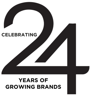
Since 2000, we’ve helped countless companies across Perth, Western Australia, increase their brand value through all types of media. There’s one thing that’s absolutely instrumental in taking your business to the next level: graphic design. Let’s take a look at the different ways graphic design can help your business and take your brand to an entirely new level in the process. The values of great design in business:
Different by design
Different by design
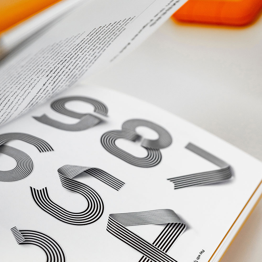
Ninety percent of the information transmitted in the human brain is visual. Google defines Graphic Design as ‘the art or skill of combining text and pictures in advertisements, magazines, or books.’ We feel that’s far too vague and neglects to state the value that design adds to a business.
We propose a new definition of graphic design – The arrangement, organization, and manipulation of content, imagery, and graphic elements into compelling formats for both digital and print mediums. The clear communication of value, benefits, and reasons to believe in a brand’s product, service, or technology.’ Graphic Design is the development of visual communications that resonate with a specific target audience with an objective to create awareness, shape perceptions, increase market share, and elevate brands.
And that’s what we continue to deliver!
Effective solutions
Effective solutions
In today’s cluttered online marketplace, brand recognition is everything. A graphically striking, attractive, and cohesive brand image will both draw new customers to your business and help you retain existing ones. One of the values graphic design offers is the essence of standing out from the crowd.
Even if you have a great company slogan, it’s ultimately the visuals associated with your brand that people will remember. Think of it this way—we all recognize the Nike “check mark” symbol even with no text attached. The human brain is simply wired in such a way that most people understand pictures much more quickly than words or data. Over 65% of people are visual learners, meaning that they process concepts and commit them to memory through primarily visual means. Powerful images are therefore the most efficient and effective way of getting people to connect with your brand’s message.
Good vibrations
Good vibrations
Speaking of presenting key information in an impactful way, when you’re first launching your business (or trying to scale your business to the next level), there’s no one you need to impact more than investors.
When you pitch to investors, you need to frame your brand in a way that builds value, and clearly communicates why they should funnel resources into your company. Well-designed presentations and pitch decks are key for driving funding. Not only do they present key information in a way that’s attention-grabbing and visually impactful, but they also show that you know how to communicate clearly and effectively.
Bottom line: As a business, you need money. Sometimes, you need that money to come from investors. And if you want to get that money from investors, you need to leverage graphic design to create a presentation or pitch deck that shows them why you’re worth the investment.
Increasing Your Customers Interaction
Increasing Your Customers Interaction
Well-designed marketing materials are key to staying top of mind with potential clients and customers. Build the marketing arsenal that will do the work for you.
When you connect with a new business contact, you want to stay top of mind long after the conversation is over. And the best way to do that? Graphic design, of course.
Well-designed marketing assets (like business cards, flyers, presentations or brochures) are crucial for growing your business because they continue to deliver key messaging to potential clients and customers when you’re not around. They also give you are also worth the time investment, once the initial design is done, all that’s left to do is get your marketing assets out into the world.
Strengthening your brand assets
Strengthening your brand assets
When you use multiple versions of logos, typefaces and colours in your business communications you create inconsistency, making your organisation appear haphazard and unprofessional.
We create a reliable image, helping to ensure graphic elements are used consistently throughout your organisation in both internal and external communications, marketing and advertising materials, websites and products.
Overall consistency creates a sense of structure for the viewer. Which helps them understand more about your product, idea or message. Consistency is key for customers to develop trust and confidence in your business!
Capturing Your Customers Attention
Capturing Your Customers Attention
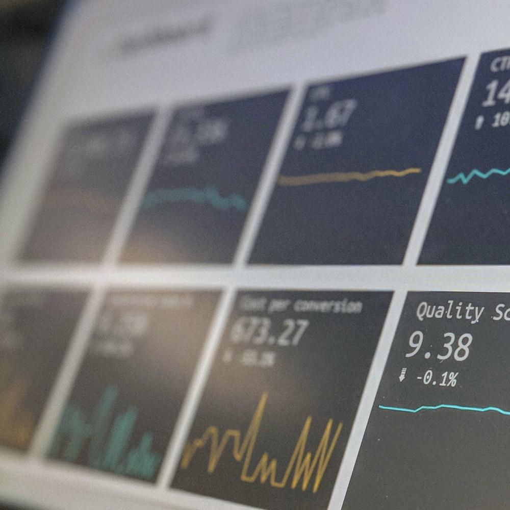
Most of us are constantly inundated with information from mobile phones, computers, television, radio, signage, magazines and more. And our attention spans are getting shorter. For marketing efforts to remain effective in this time of change we now only have a few seconds to capture viewers’ attention and keep it. Chances are, there is a ton of information about your business that you want to get out in the world—everything from annual sales to performance data to engagement statistics. And all that data can be super impactful if you get it in front of the right people.
But if you present it in a way that falls flat, it doesn’t matter how impactful the information about your business is, it’s not going to connect with your audience. Who wants to read through an endless stream of spreadsheets, bullet points, and huge blocks of text? The answer is no one. And that’s where graphic design comes in.
Leveraging graphic design allows you to present key data, information, and statistics about your business in a way that’s going to pack a powerful punch and make a real impact on your audience.
Brands we collaborate with
